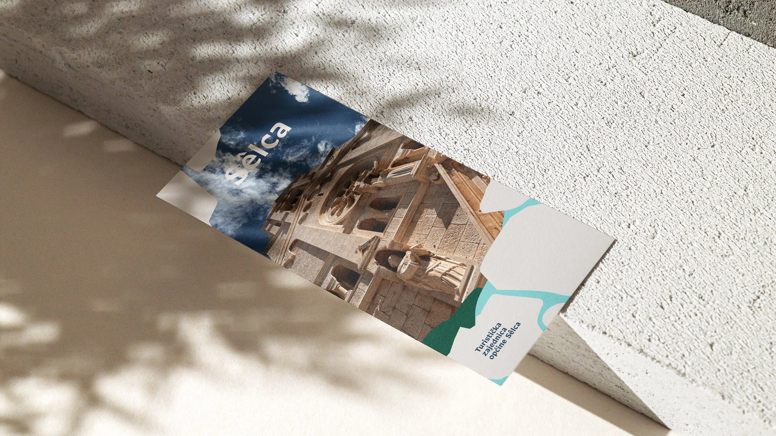
TZO Selca
Vizual identity for tourist board of Selca
ABOUT
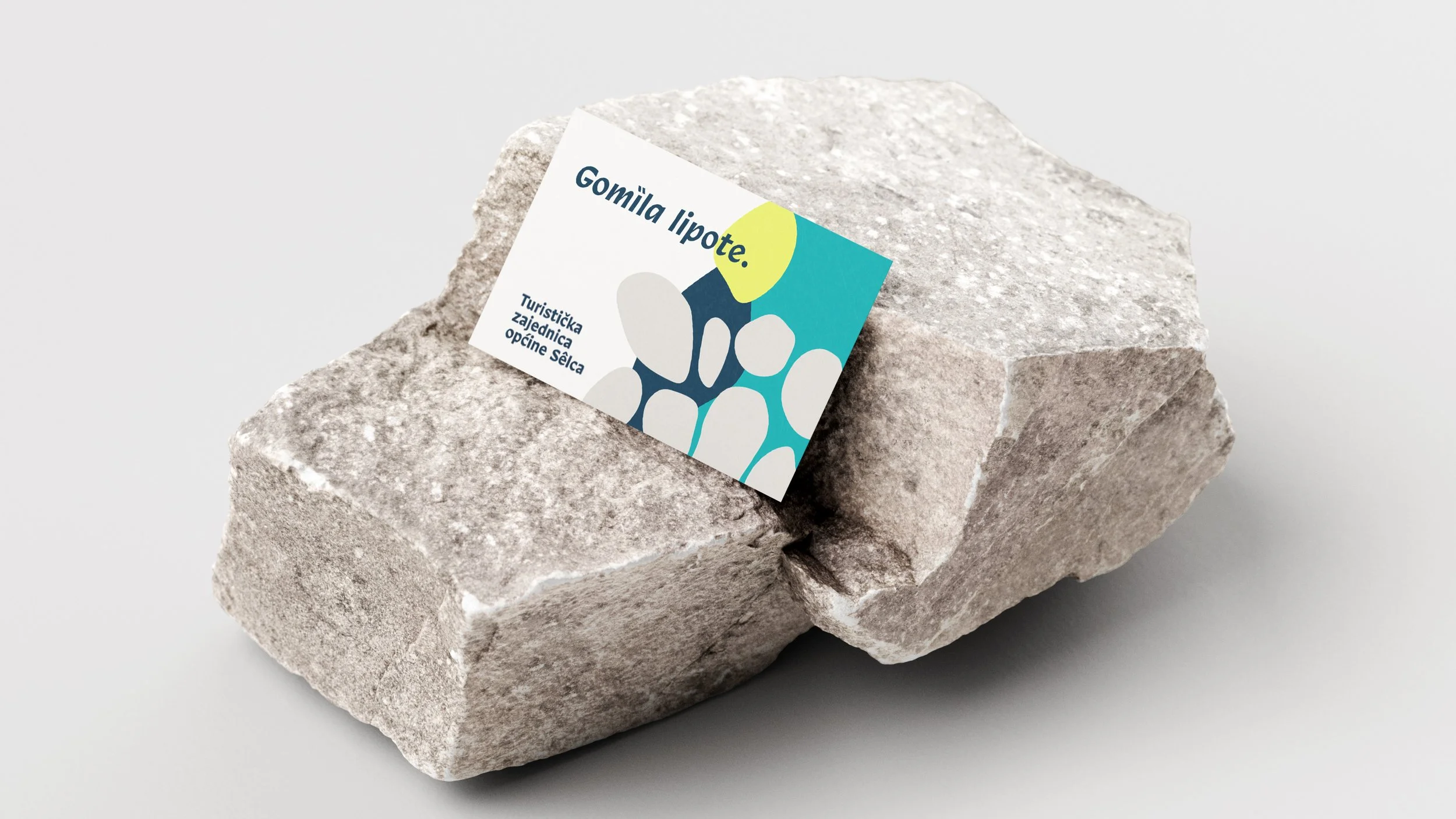
The logo of the Selca Municipality Tourist Board visually consists of a stylized depiction of a gomila — a traditional dry-stone structure — as the central motif, complemented by additional elements symbolizing seaside bays and the sun/olive oil.


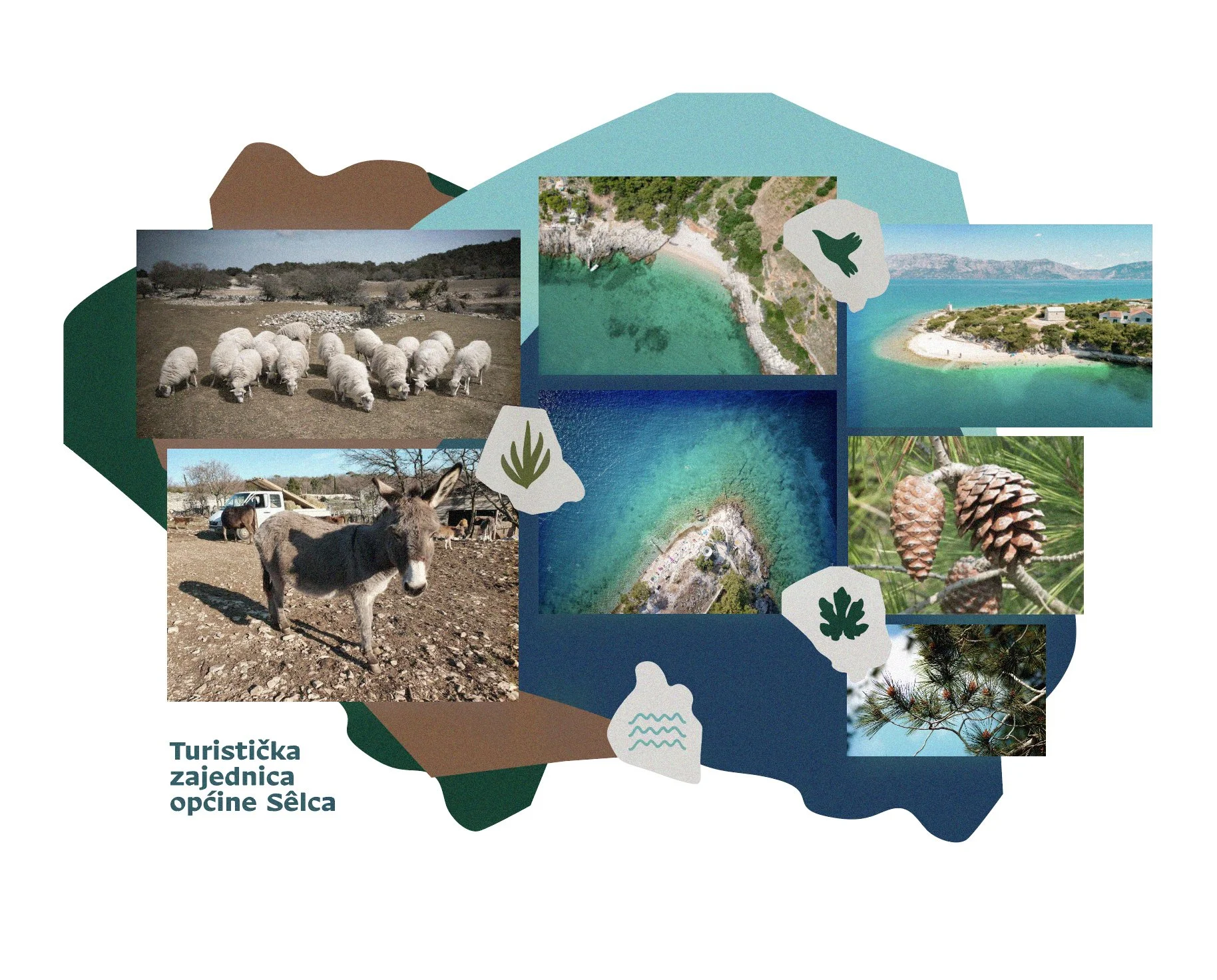

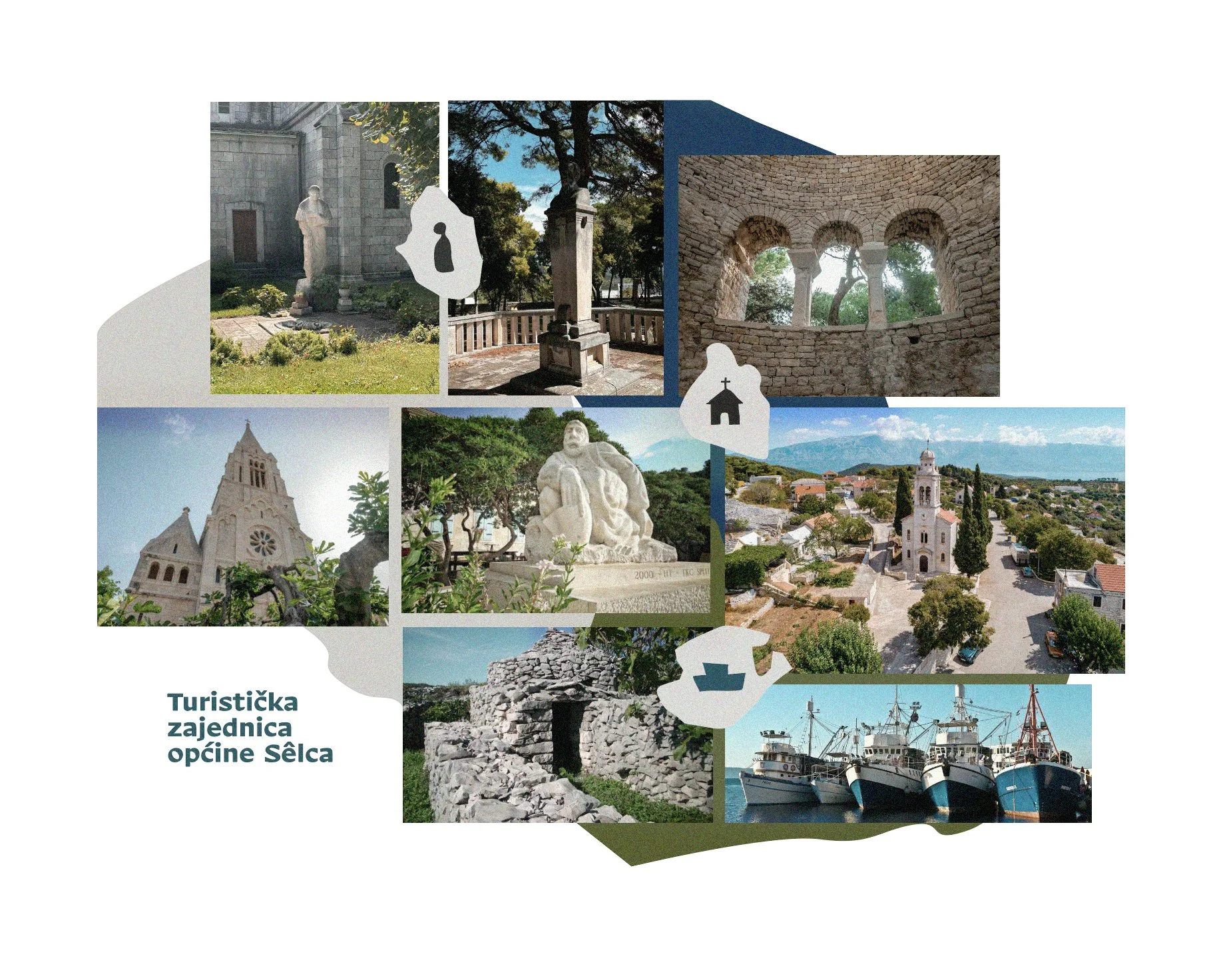
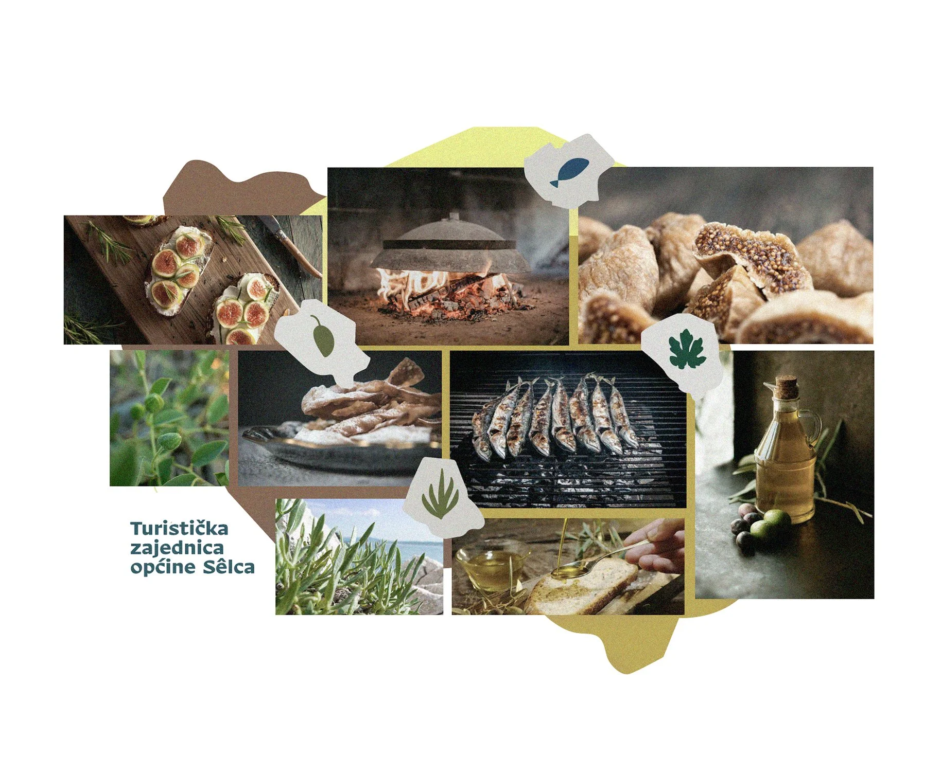
The overall design brings together the heritage, nature, and traditions of Selca into a simple yet distinctive visual identity.
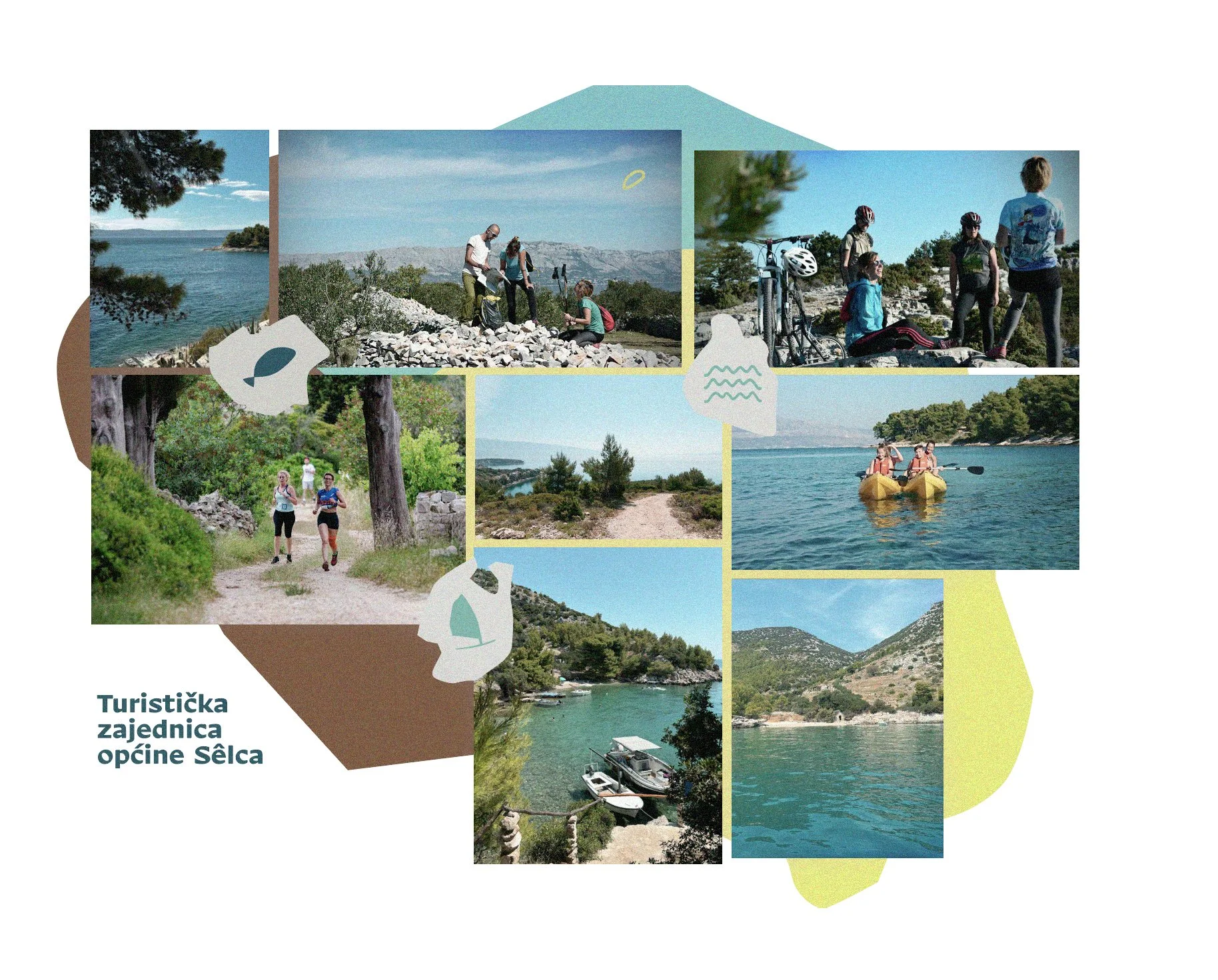
A contemporary and minimalist approach ensures that the logo remains recognizable and easily applicable across various media. The integration of modern and dynamic elements allows the logo to reflect the municipality’s forward-looking character while preserving a strong connection to its cultural roots.

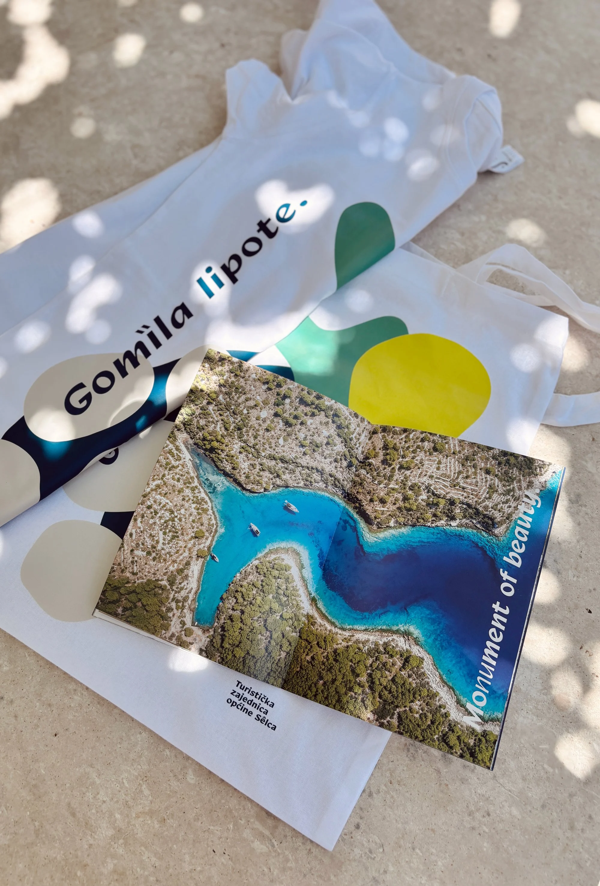
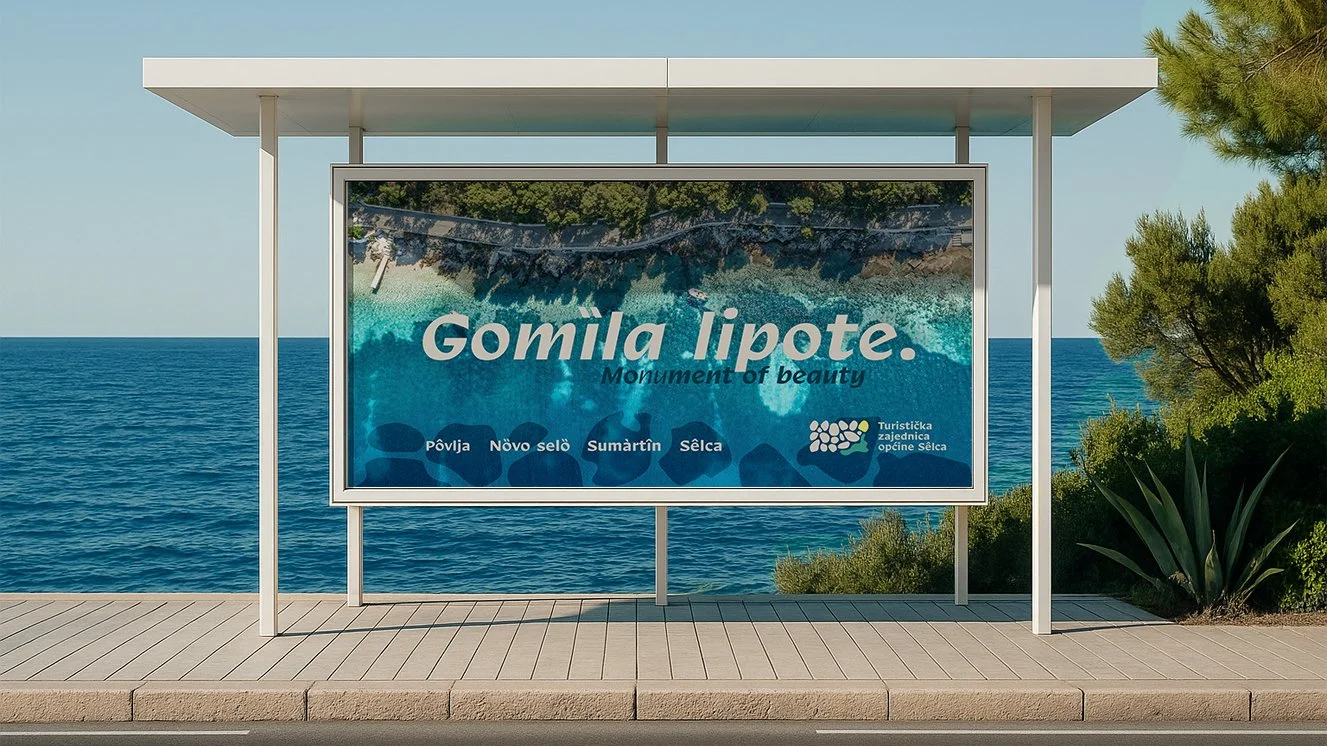
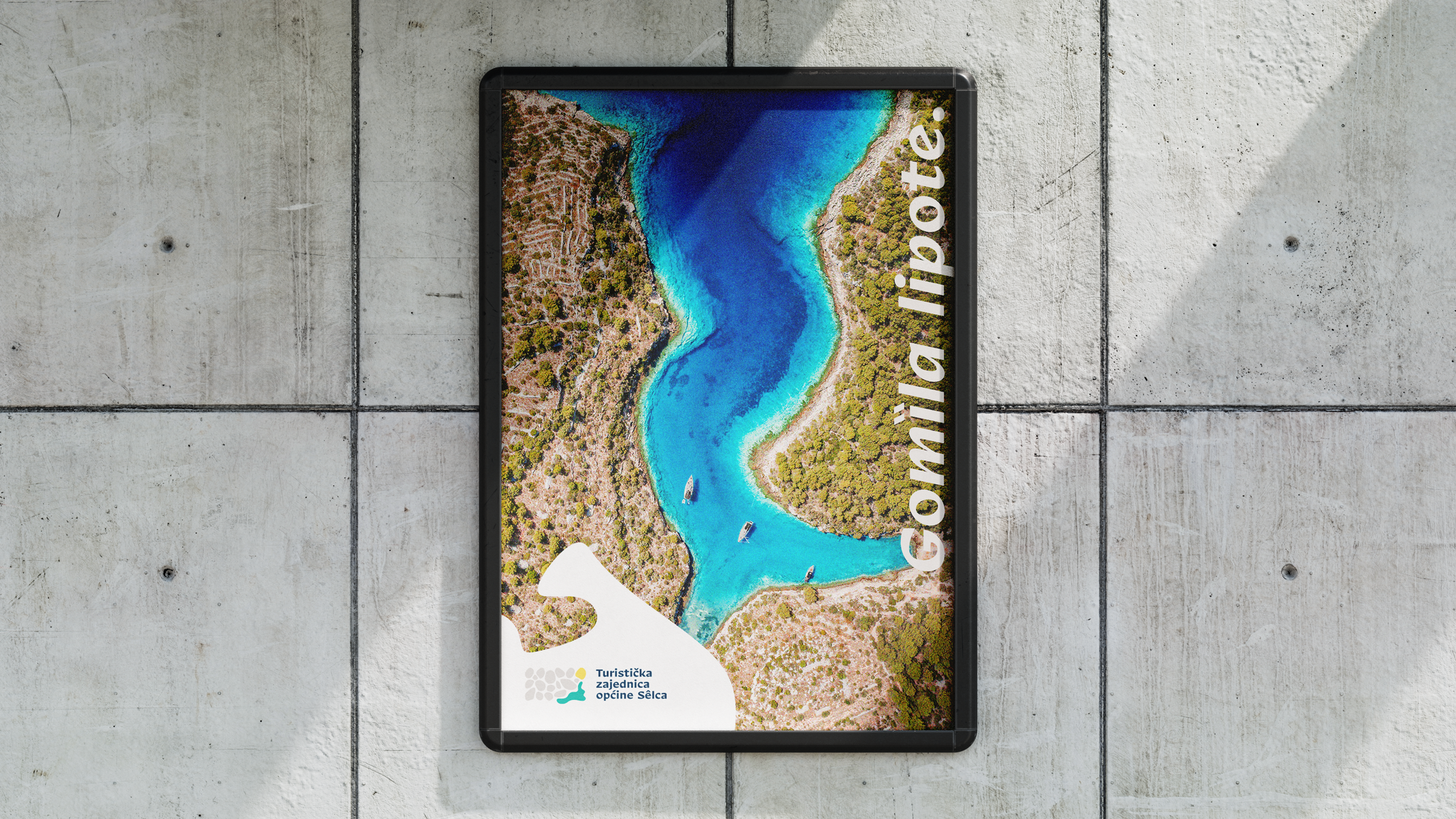
The slogan “Gomila lipote” completes the visual concept by connecting local heritage with a sense of abundance.
For residents, gomila refers to the traditional dry-stone wall — a symbol of their cultural identity — while for visitors, it conveys a richness of beauty.
Paired with lipota (“beauty”), it creates a playful and emotive word interplay that captures the spirit of this region.